How to Curate Stock Images That Feel On-Brand
One of the biggest hurdles many creatives and founders face when designing a website is not having enough quality imagery.
Maybe you haven’t had a brand shoot yet, or the photos you do have don’t fully reflect the mood, aesthetic, or energy of your brand. That doesn’t mean you have to settle for generic, overused visuals.
When selected intentionally, stock imagery can still feel cohesive, fresh, and aligned with the world you’re building around your brand.
Start With the Visual Direction
Before searching a stock image library, get clear on what the images need to communicate. This will save time and help you avoid choosing photos simply because they look good individually.
Consider three things:
Your mood and tone: Choose a few words that describe how the brand should feel, such as calm, editorial, grounded, vibrant, artistic, modern, or refined.
Your color palette: Look for images that naturally complement your brand colors. They do not need to match perfectly, but the lighting, temperature, and dominant tones should feel consistent.
The moments you need to show: Think beyond your services and identify the scenes, emotions, or experiences that support your story. A coach might look for images representing reflection, collaboration, transformation, or everyday rituals rather than another generic laptop photo.
Search Beyond the Obvious
The quality of your results depends heavily on how you search. Instead of typing broad terms such as “wellness” or “business owner,” combine specific details related to feeling, environment, lighting, color, and style.
Your search terms might include:
Feeling: softness, joy, connection, movement
Setting: home studio, rooftop, city park, window light
Concept: balance, transformation, clarity, expansion
Color and lighting: warm neutrals, golden hour, soft shadows
Aesthetic: editorial, film, vintage, muted, organic
For example, you might search for “minimal desk with beige tones and brown skin hands,” “sunlight through a window during a quiet moment,” or “Black woman in movement with editorial lighting.”
These details help you find images that feel more specific to your brand rather than like the first result everyone else selected.
Go Deeper Than the First Page
Most people choose from the first few rows of results, which is one reason so many websites begin to look the same. Explore multiple pages and use filters for orientation, color, image age, or upload date when available.
You can also search lesser-known stock libraries or sort by the newest and least-downloaded images. The goal is not necessarily to find the most polished photo. It is to find an image that contributes to the larger visual story without feeling overly familiar.
How We Used Stock Imagery for NEO Classical Pilates
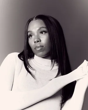
With the exception of the founder portrait and one paid image of a specific Pilates machine, the NEO Classical Pilates website was built entirely with free stock images.
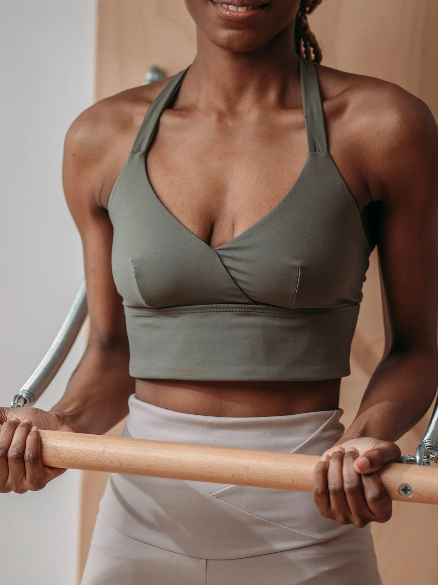
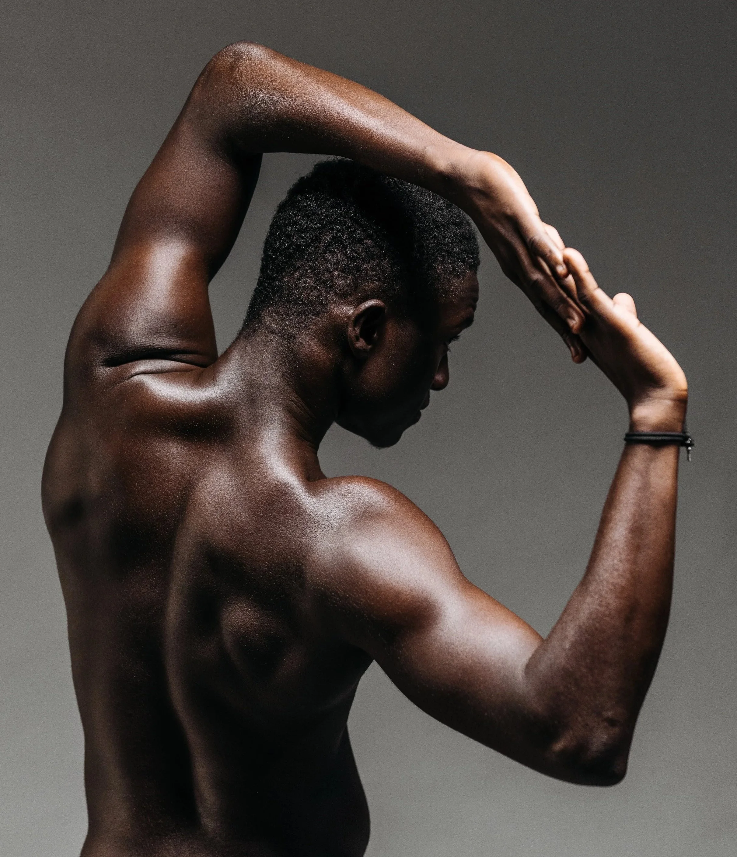
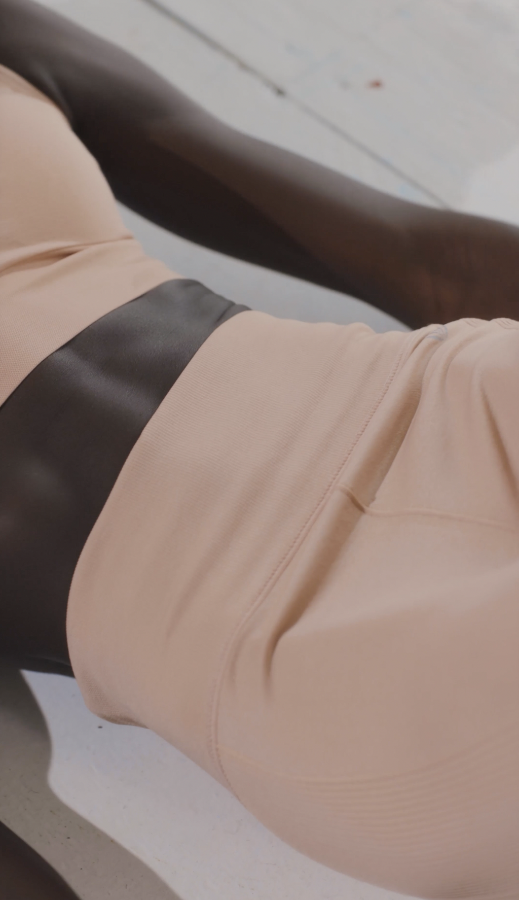
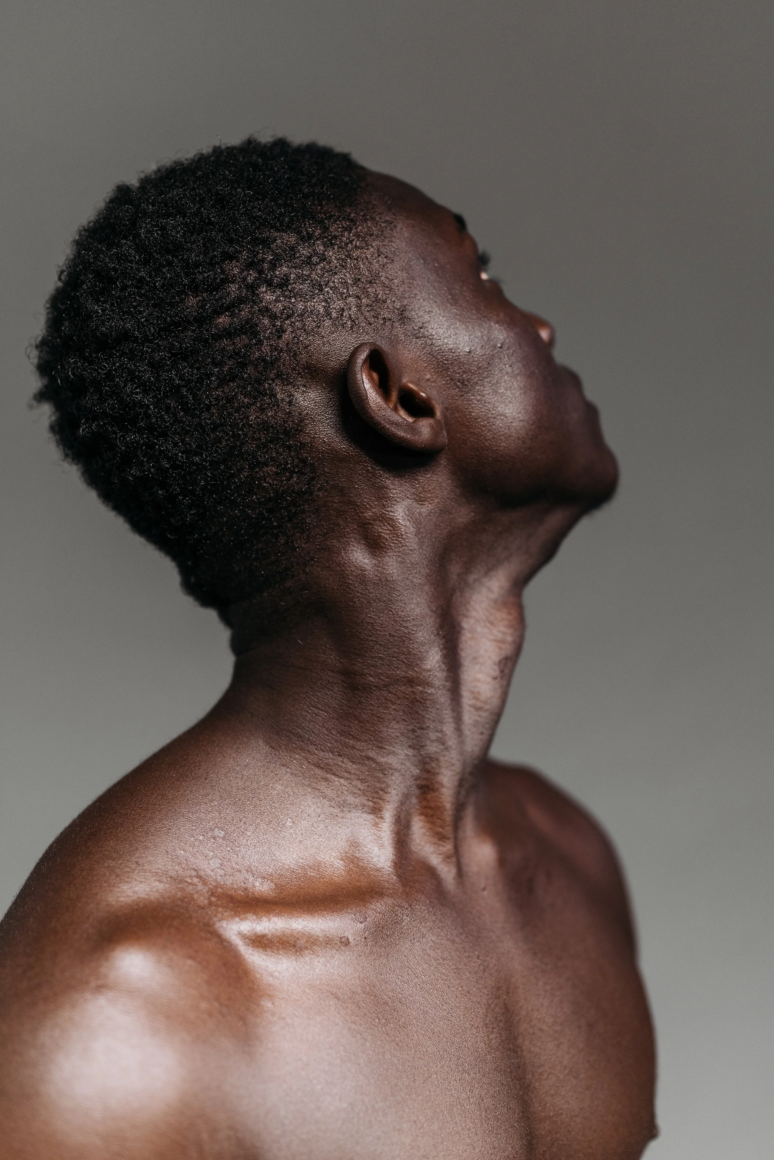
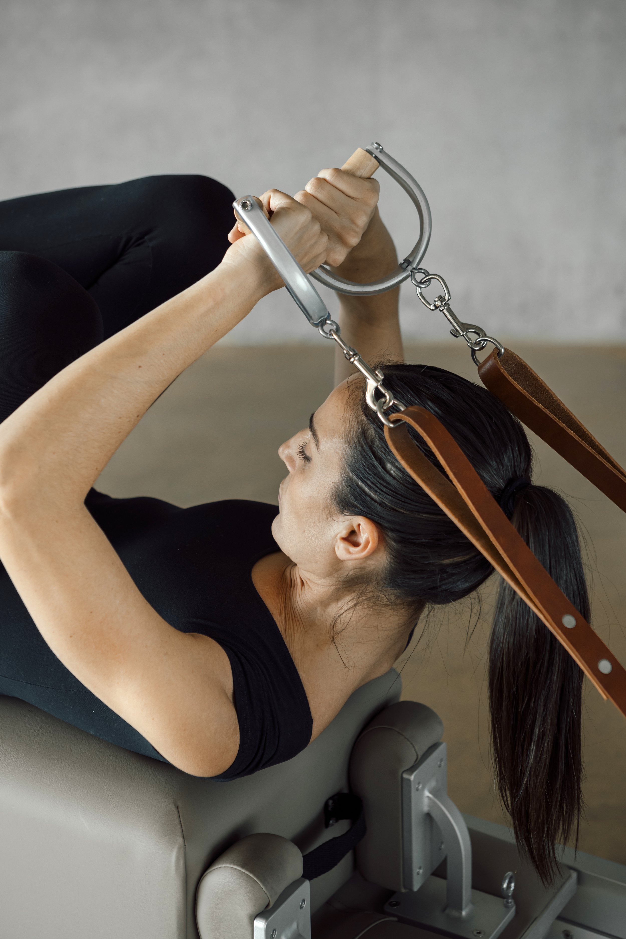
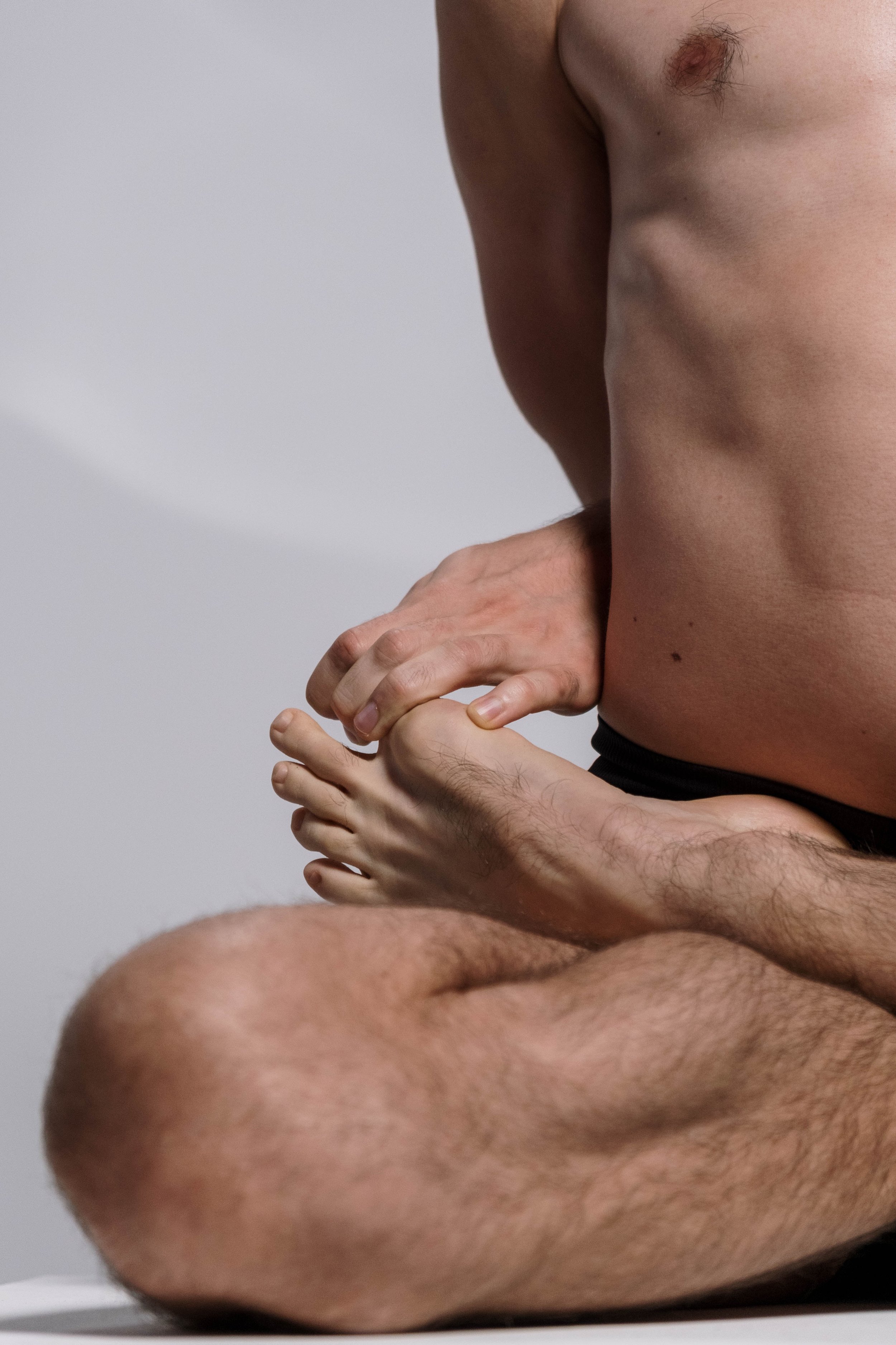
The website still feels elevated and cohesive because every visual was selected using the same creative direction:
Cohesive tone: The images create a sense of calm, fluidity, and intentional movement through soft lighting and a minimal, slightly moody aesthetic.
Color consistency: Neutrals, creams, soft greys, and occasional deeper tones keep the experience visually connected.
Thematic storytelling: The imagery supports the brand’s focus on graceful, reformer-based movement, embodiment, and refinement.
Unexpected details: Rather than relying only on full-body workout photos, the site uses close-ups of movement, hands, equipment, light, and atmosphere to communicate how the experience feels.
The images came from different sources, but they feel like they belong together because they were curated through one clear visual lens.
Stock Images Can Still Feel Like Your Brand
Stock imagery does not have to feel boring or disconnected. With a clear direction, thoughtful search terms, and consistent visual choices, you can create a website that feels distinct even before investing in a custom brand shoot.
The goal is not to make every image look identical. It is to choose visuals that feel like they belong in the same world.
Visual curation is part of our website design process at Die Free Studios. From image strategy and copy to layout and launch, we help clients turn the materials they already have into a website that feels complete, intentional, and aligned with where their brand is going.